
Monday, December 31, 2012
Sunday, December 30, 2012
Recycled Currency Stationery by Crane's
Several days ago I was rummaging around in a desk drawer where I keep miscellaneous stationery -- notepads, legal pads, notebooks, and things like that. And I ran across an item I had forgotten about: a pad of paper that was made from recycled U.S. currency. Even if it were not for the legend stamped at the bottom of every page (see photo), this paper would nevertheless betray its origins by its overall green shade and green fibrous flecks woven into the paper. In spite of being recycled, it's quite a heavyweight paper, and takes fountain pen ink really well.

This got me to thinking about where this paper originally came from. According to the Internet, the paper for U.S. currency is made by Crane's, with a content of 75% cotton and 25% linen. This mix makes it way more durable than ordinary paper made from wood pulp. But when you recycle any kind of paper, it weakens the fibers and the recycled paper is never as strong as the original. But in the case of this paper, it can still be pretty darn good.
So in the 1990's, Crane's experimented with making this recycled currency paper, and marketed it under the brand name "Old Money." (I am pretty sure this is when I bought this paper, so it's about 20 years old at this point.) It's great paper, but then as now, there was little to no consumer demand for it, so production was dropped.
BUT: thinking about the lineage of this paper, it suddenly occurred to me that this qualifies as genuine Crane's stationery. Cheaper, and greener (in more ways than one), but still definitely Crane's!

I really like this paper, and I would like to track down some more of it, if any exists. If anyone has any leads to a source for this paper, please let me know in the comments!
Monday, December 24, 2012
Merry Christmas!

I was fooling around with a pointed pen last night, and generated this. It turned out pretty well, so I am sharing it with you, and wishing you the same. Merry Christmas!
Friday, December 21, 2012
Pilot Cavalier Marbled Fountain Pen For Trade
OK, this is really kind of a heartbreaking post for me to write. I bought this Pilot Cavalier marbled fountain pen a while back on eBay. It wasn't the cheapest pen I ever bought, but it was a good price for what I got. I bought it for two reasons: 1) It's a Pilot, and I love pretty much any Pilot I have ever owned; and 2) the brown marbled design on the pen is absolutely stunning. (My crappy pictures don't do it justice, but trust me, it is a beautiful pen.)


 It's the nib.
Lord knows, I am no fountain pen expert (although I do have a blog and I have stayed at a Holiday Inn Express at least once in my life), but everyone knows that the cardinal rule of fountain pens from Japan is: THE NIBS RUN SMALL. So if you want a fine, you should order a medium. What happens, do you think, when you get a fine?
You get a pen that lays down a line no thicker than a mosquito's eyelash. And that's pretty darn thin.
Don't get me wrong, I love absolutely everything else about this pen. And I love the appearance of the nib itself -- look at how streamlined and sleek it is. It fits the overall style of the pen perfectly.
But it's SOOOOOOOOOOOOOO FINE -- and I don't mean fine in a good way.
Therefore, I am going to try something here. I know I have about 3 readers (who knows, I may be flattering myself with even THAT number). But I really want this pen to go to a good home, and I wouldn't mind getting another pen that would be more suitable for me and my writing style.

So how about a trade? I would love to trade this pen (in perfect condition, inked only once, and it will be clean as a whistle when I send it out -- I think I still have the box as well) with someone who wants to get rid of a low-end Pilot that is comparable. As long as I am throwing this out there to the Universe, might as well go for broke -- I would ABSOLUTELY love to trade it for one that is exactly the same, except with a medium nib. But I am not that persnickety.
Respond in the comments please, and let's see what happens!
UPDATE: This pen has now been traded.


There's one fly in the ointment, however, and for me it's a pretty big fly. Have you guessed what it might be yet, from the pictures?

Think, think think!

Lord knows, I am no fountain pen expert (although I do have a blog and I have stayed at a Holiday Inn Express at least once in my life), but everyone knows that the cardinal rule of fountain pens from Japan is: THE NIBS RUN SMALL. So if you want a fine, you should order a medium. What happens, do you think, when you get a fine?
You get a pen that lays down a line no thicker than a mosquito's eyelash. And that's pretty darn thin.
Don't get me wrong, I love absolutely everything else about this pen. And I love the appearance of the nib itself -- look at how streamlined and sleek it is. It fits the overall style of the pen perfectly.
But it's SOOOOOOOOOOOOOO FINE -- and I don't mean fine in a good way.
Therefore, I am going to try something here. I know I have about 3 readers (who knows, I may be flattering myself with even THAT number). But I really want this pen to go to a good home, and I wouldn't mind getting another pen that would be more suitable for me and my writing style.

So how about a trade? I would love to trade this pen (in perfect condition, inked only once, and it will be clean as a whistle when I send it out -- I think I still have the box as well) with someone who wants to get rid of a low-end Pilot that is comparable. As long as I am throwing this out there to the Universe, might as well go for broke -- I would ABSOLUTELY love to trade it for one that is exactly the same, except with a medium nib. But I am not that persnickety.
Respond in the comments please, and let's see what happens!
UPDATE: This pen has now been traded.
Wednesday, December 19, 2012
Review: Exacompta Index Cards
I won these index cards in a giveaway hosted by Stephanie at Rhodia Drive, and they were sent to me directly from the fine folks at Exaclair. They came along with an awesome Rhodia webnotebook and a index card folder, but today I am reviewing just the index cards.

Packaging is always beautiful and PERFECT on Exaclair products like these.

Four different pastel colors -- easy on the eyes!

These are high quality index cards with a beautifully smooth surface. As you might expect, they take fountain pen ink like champions, with absolutely no feathering or bleedthrough.

Yes, index cards are just about as utilitarian a product as they come, but if you have to use them, shouldn't you use cards that are pleasing and high quality? I say yes! These are highly recommended!
Saturday, December 8, 2012
Review: Bic Fountain Pen
Today I want to review something that is a juxtaposition of two items that normally don't go together: the Bic Fountain Pen. I have had this particular pen for some time now. You probably will have a hard time finding this in the United States, if it's available at all. The wording on the packaging suggests that it is a product of the U.K./Europe, but never fear -- there always seem to be plenty of these for sale on eBay, so this pen is as close as your nearest mouse and keyboard (or these days -- touch screen, I suppose).
This is an especially compact fountain pen due to its simple but elegant telescoping nib unit. However, the other Bic fountain pens I own are equally compact, so this is evidently a design decision on the part of Bic, and they carry it off marvelously.

The pen accepts international ink cartridges, and the nib is elongated and striking, with interesting holes along either side. As far as I can tell, these holes are merely decorative. This particular pen has a fine-to-medium nib, although you obviously don't get a choice with this ultra-low-end kind of pen. Other models I own have nibs that are essentially fine, though, so there is obviously some variation here. That's OK -- it just adds to the excitement of writing with the pen for the first time! The body on this model has a slightly rubberized finish, which gives it a good feel in the hand.

One of the reasons I like this pen is that the design of the cap and nib has this vaguely retro "World of Tomorrow" feel, like something straight out of Tomorrowland at Disney World.


The only possible drawback with this pen is the telescoping mechanism, a feature that I have not seen on any other Bic fountain pen. Even though it works flawlessly, it's one extra step between uncapping the pen and writing, so it does slow one up from time to time. However, it must not slow me up too painfully, since I do return to writing with this pen regularly.

I highly recommend this pen; if you can find one by scouring the Internet, by all means buy it -- it's well worth its price!
Monday, November 26, 2012
Happy Mail: Rhodia Drive Anniversary Giveaway Prize
Back just before Thanksgiving, I had a very happy mail day. Stephanie over at Rhodia Drive (one of my favorite blogs, even BEFORE the giveaway) held a giveaway to celebrate the third anniversary of her blog, and I actually won one of the prizes!
The prizes were supplied by the fine folks at Exaclair, makers of excellent European paper and pen products. This particular prize package included a Rhodia dot grid Webnotebook, a package of multicolored Exacompta index cards, and a small folio just right for tucking the cards into.

All these products are new to me, so I'll be posting reviews of the Webnotebook and the cards very soon! (The folio is nice, and well made, but it's just a folio -- so not much reviewing there!)
Sunday, November 18, 2012
George Herbert on Thanksgiving: Calligraphy Practice
Wanting to get some calligraphy practice in, and wanting a quote relevant to this time of year, I happened upon this beautiful quote by the English poet George Herbert. I was just playing around with it, and interested mainly in practicing the letters, so the line breaks are not where they need to be. Still, I was pleased with the way it turned out.

It's a little early still, but Happy Thanksgiving!

(Moon Palace Sumi Ink, Mitchell Elbow Copperplate Nib, Rhodia paper)
Thursday, November 8, 2012
Review: Evernote Smart Notebook by Moleskine
The minute the news came out about the Evernote Smart Notebook, I knew I was going to have to have one. And I was very pleasantly surprised by this great notebook. It has already become one of my daily companions.
Made by Moleskine, the styling of this notebook is exquisite. The eye-catching cover is embossed with various life and productivity symbols (including the iconic Evernote elephant right in the center), and it's definitely been a topic of conversation with everyone who has seen my notebook. The lime green ribbon marker and elastic closure are perfect touches as well.

The paper is typical Moleskine notebook paper, which is to say: smooth and beautiful, but average in how it deals with various pens. Wet-writing pens, including fountain pens, are always going to bleed through this paper, but there doesn't seem to be excessive amounts of feathering with it.

The thing that makes this notebook worth the money is the included stickers and built-in tagging system. In my testing, they work perfectly to help categorize pages in the notebook as they are uploaded to your Evernote account. Here's how they work: First you choose a sticker that suits the particular category of your writing. (If none of the pre-assigned sticker categories do it for you, the categories can be easily reassigned inside the Evernote mobile app.) I used the "work" sticker and reassigned it to my Evernote "Blog" notebook with a "pens" tag. Then I took a picture of the page with a sticker on it. I have to say that the "page camera" option in the Evernote app does not take beautiful pictures, as a rule. For getting information into your Evernote account, it's good enough, though. Perhaps the page camera will improve with later versions of the software.
Now here's the insanely cool part. The minute I uploaded these pictures to my Evernote account, the system used the sticker to automatically put the picture into the correct notebook, along with the associated tag. It's a completely seamless process, and it works REALLY well. Now I have handwritten pages in the cloud, as well as in a physical notebook, which is a comforting thing from an OCD standpoint.

This got me to wondering... do the stickers and the automatic tagging process work with pages from an ordinary notebook? Interestingly (and understandably, for the sake of Evernote's and Moleskine's bottom line), the answer is no. In my tests, pictures of pages from other notebooks went into my normal default Evernote notebook, even with the sticker present. There is evidently a special code built into the pages of the Moleskine notebook -- it seems to be the pattern of dots that constitute the lines on the page (both in the ruled and grid versions). I must point out that the company says as much in their promotional materials, and it is indeed true.

All in all, I can highly recommend these notebooks. Right now, they appear to be available only from Moleskine (via their website). The notebooks are not cheap, but for what they do and how they are made, I think they are well worth the price. In addition, the notebook comes with 3 free months of Evernote Premium. If you are already a premium subscriber, as I am, the code that is pasted in the back of the notebook simply extends your existing subscription by 3 months. This is a pretty good value, and definitely defrays some of the cost of the notebook.
In short, fans of Moleskines and Evernote should take the next natural step and combine the two to help with capturing anything and everything that can be put on a page.
Made by Moleskine, the styling of this notebook is exquisite. The eye-catching cover is embossed with various life and productivity symbols (including the iconic Evernote elephant right in the center), and it's definitely been a topic of conversation with everyone who has seen my notebook. The lime green ribbon marker and elastic closure are perfect touches as well.

(Turns out that it's really hard to get a picture that captures all the details of this notebook, including the beautiful embossing on the front. So I tweaked the photo to bring the embossing details out.)

(I wrote the beginnings of this post in the notebook. Seemed appropriate, somehow!)
Now here's the insanely cool part. The minute I uploaded these pictures to my Evernote account, the system used the sticker to automatically put the picture into the correct notebook, along with the associated tag. It's a completely seamless process, and it works REALLY well. Now I have handwritten pages in the cloud, as well as in a physical notebook, which is a comforting thing from an OCD standpoint.

(It's kind of fun to stick the little stickers on the page. They can go anywhere on the page and still work, supposedly, but I thought they needed to go in the top right corner. Don't ask me why.)

(The ribbon bookmark is a much prettier green and is much more striking than my crappy picture suggests.)
In short, fans of Moleskines and Evernote should take the next natural step and combine the two to help with capturing anything and everything that can be put on a page.
Wednesday, November 7, 2012
The Field Notes Colors Subscription Begins
A few days ago I received a small but bulky package in the mail, and here's what was inside:

These notebooks are simply some of the best. Also great are the free pen (I love Field Notes pens because they are traditional, no-frills ballpoints that JUST WRITE) and the button tied to the "Traveling Salesman" theme of the current notebooks (on the right in the picture). All told, a very happy mail day, and I will be reviewing the TS notebooks soon.
Anyone else get these notebooks in the mail recently?

A family portrait, of sorts.
Anyone else get these notebooks in the mail recently?
Thursday, November 1, 2012
JetPens Order: Happiness!
I recently placed an order from the incomparable JetPens. I ordered some pens that caught my eye and ones that I wanted to try out. I also ordered a pack of green ink cartridges for my Pilot Parallel Pen. Here's a picture of the loot!

From left to right:
Pentel Vicuna ballpoint, 0.7 mm, black body and ink
Zebra Sarasa Clip, 0.7 mm, brown ink (This pen is amazing -- it's like writing with liquid chocolate.)
Uniball Signo 0.38 mm, bordeaux black (The ink of this pen is essentially a reddish-black. Or a blackish red. Either way, it's an interesting color!)
Uniball Signo 0.38 mm, green-black (Same as above, but in green. I REALLY like this color of ink.)
Zebra SL-F1 mini ballpoint pen, 0.7 mm, navy body, black ink
Pentel TRFS Tradio mini fountain pen, M nib, black body, refillable
Platinum Preppy fountain pen, F nib, refillable
It may take me a little while, but I plan to post reviews of all of these great pens!
Saturday, October 27, 2012
Review: Sharpie Pen - Stainless Steel
I have always wanted to like the Sharpie pens, ever since they first came out in their "won't bleed through paper formulation." I have used Sharpie markers in the lab forever, it seems, and I even had an advisor in graduate school who wrote with the markers routinely, as he helped me plan out experiments on paper. Those markers bleed through paper like crazy, of course, because that's not what they are designed for, but he didn't care. That was the only kind of Sharpie available back then, and we always had lots of Sharpies sitting around the lab (and likely as not, the "piece of paper" would actually be a paper towel, and EVERYTHING bleeds through a paper towel).

But of course, I am always on the quest for the holy Daily Writer (DW), and the Sharpie pen is beautiful enough that it always catches my eye in the store. However, I can't like the Sharpie pen for it to ever be a serious contender for the DW. There are lots of reasons for this, and I have not come to this decision lightly. For one thing, it's a felt-tip pen. My earliest recollection of trying to like a felt-tip pen was when the Flair pens came out in my childhood. I didn't and don't like them either, although I will grant you that a Sharpie pen is head and shoulders above a Flair. It's mostly an occupational reason: I deal with 3-part NCR forms on a routine, if not daily, basis. Felt-tip pens are usually not suitable for these kinds of forms because they require a certain amount of pressure to make the transfer to the sheets underneath. So when I have to fill out one of these forms, it's always a ballpoint for me. (Maybe I should experiment with one of the Sharpie pens and see if it might possibly work?)

Then there's the Sharpie pen's ink. I am admittedly not that adventuresome when it comes to ink. Black is ALWAYS my first choice, and then green and red (in that order), mostly because of my occupational need of marking up stuff and grading tests. (Blue is never an option, although in the past I have been observed buying blue pens in a fit of insanity -- but these are always pens I have to throw out or give away later, because I never actually want to write with them.)
So black it is. But it has to be the darkest, truest black that there ever was. Blacker than the outer reaches of space, or the heart of the most evil person on Earth. I find myself pining for the black ink that Rudyard Kipling required for his writing. And here is where the Sharpie pen falls short most grievously, in my book. The ink goes on the page fairly black, but it quickly dries to a lighter shade of black, verging towards a dark gray. Dark gray will never be black, to me. I suppose it has to do with the "no bleed through" formulation of the ink, since Sharpie marker ink writes jet black and stays jet black.


All the Sharpie pens are beautiful -- their style is consistently one of their best features. This one is no exception: the sleek, attractive stainless steel body, the small black button endcaps that subtly tell you the color of the ink inside the pen, and the slightly cushy rubbery grip. The whole pen feels good in the hand, and it's lightweight enough to write with for hours. For what they are, the Sharpie pens do what they advertise. But they are not anywhere near the competition in the quest for the Daily Writer.
Sorry, Sharpie pen! We can definitely be casual friends, but that's about all you can expect from me.


But of course, I am always on the quest for the holy Daily Writer (DW), and the Sharpie pen is beautiful enough that it always catches my eye in the store. However, I can't like the Sharpie pen for it to ever be a serious contender for the DW. There are lots of reasons for this, and I have not come to this decision lightly. For one thing, it's a felt-tip pen. My earliest recollection of trying to like a felt-tip pen was when the Flair pens came out in my childhood. I didn't and don't like them either, although I will grant you that a Sharpie pen is head and shoulders above a Flair. It's mostly an occupational reason: I deal with 3-part NCR forms on a routine, if not daily, basis. Felt-tip pens are usually not suitable for these kinds of forms because they require a certain amount of pressure to make the transfer to the sheets underneath. So when I have to fill out one of these forms, it's always a ballpoint for me. (Maybe I should experiment with one of the Sharpie pens and see if it might possibly work?)

(Do you think this point would stand up to an NCR form?)
So black it is. But it has to be the darkest, truest black that there ever was. Blacker than the outer reaches of space, or the heart of the most evil person on Earth. I find myself pining for the black ink that Rudyard Kipling required for his writing. And here is where the Sharpie pen falls short most grievously, in my book. The ink goes on the page fairly black, but it quickly dries to a lighter shade of black, verging towards a dark gray. Dark gray will never be black, to me. I suppose it has to do with the "no bleed through" formulation of the ink, since Sharpie marker ink writes jet black and stays jet black.


All the Sharpie pens are beautiful -- their style is consistently one of their best features. This one is no exception: the sleek, attractive stainless steel body, the small black button endcaps that subtly tell you the color of the ink inside the pen, and the slightly cushy rubbery grip. The whole pen feels good in the hand, and it's lightweight enough to write with for hours. For what they are, the Sharpie pens do what they advertise. But they are not anywhere near the competition in the quest for the Daily Writer.
Sorry, Sharpie pen! We can definitely be casual friends, but that's about all you can expect from me.

(This ink probably would not have been black enough for Mr. Gandhi, either.)
Ratings:
Style: A
Ink: C (black is not black enough)
Writing: B+ (smooth enough for a felt-tip pen, lightweight in the hand)
Blobbiness: A+ (not really a problem with felt-tip pens)
Chance that this will become a Daily Writer: 0%
Sunday, October 21, 2012
Review: Zebra Z-Mulsion EX Pen

Where do I even start with a pen like this? I'll start with the smoothness, which is obviously supposed to be a big selling point with this model. It is REALLY smooth. I mean, like velvet, gliding on ice, greased lightning smooth. It's really kind of amazing. Many pens aspire to this level of smoothness but this is one that really succeeds. According to the pen's description on Shoplet.com, the ink is an emulsion of oil, water, and pigment that is supposed to provide "an unbelievably smooth writing experience." I am here to tell you that this is NOT hyperbole, folks. It is noticeably smoother than lots of other pens in its class. Plus, with the admittedly limited testing I have already put this pen through, it does not produce the typical ink blobs that many other smooth writers seem to produce. [Edit: See the pic below. In my enthusiasm, I spoke too soon. This is such a wet writer that its "blobbiness" is in line with other pens like it. But to me it's not an excessive blobbiness, certainly not along the messy lines of a PaperMate InkJoy pen, so I still recommend this pen highly.] Because of its wet ink, as with most pens of this sort there is a small piece of plastic covering the tip to prevent drying out before the first use.


Added to this is the fact that its black ink (the model I got) is a true, dark black. The 1.0 mm ballpoint is a perfect match for the fluidity of the ink and the density of the pigment. I am eager to try out other colors in the line to see if they are in the same class ink-wise. (Note that blue and red ink versions are also available on Shoplet.com, but there are more colors shown on the promotional card I received. I'll definitely be looking around for the green in particular.)
The styling of the pen is hard to see from my crappy pictures, but I will say that it looks very sophisticated, and feels good in the hand. It is also very, very light (perhaps almost TOO light, but we won't quibble about things like that -- that will simply make it good to write with for long periods of time).

The only negative that I could possibly say about this pen (and I will say up front that this is VERY quibbly) is the click mechanism. It's good and solid in terms of how it works, which is overall quite well, but when the plunger is pushed down and the pen is extended, the plunger tends to want to flop up and down and around with a cheap sound as you move the pen. Like I said, this is just IMPOSSIBLY quibbly, and I realize this, but it is noticeable and it may be a deal-breaker for some people -- although I seriously doubt it. This is such a great overall pen that the clicker sound is something I can definitely overlook.

Ratings:
Style: A
Ink: A+, black (at least) is dark and true
Writing: A+, very smooth and gliding
Blobbiness: B- (produces some typical ink blobs but they are bearable)
Chance that this will become a daily carry pen: 95%
You should definitely check out the Zebra Z-Mulsion EX Ballpoint Pen today!
Saturday, October 20, 2012
Taking the Plunge -- Field Notes Colors Subscription
For a long time (pretty much since they first became available), and like many people in the pen/pencil/paper fetish world, I have been enamored of Field Notes. I don't use them a lot, and I am probably the next-to-last entry on their Favorite Customer list, but I love these little notebooks. And I think that Favorite Customer ranking is about to change:

Yes, it's true: I have taken the plunge and ordered a Colors subscription. "Colors" is the name they give to their special edition line of notebooks that come in different colors (duh) and designs, but all of which are evocative of some special time of year, or tidbit of Americana. For example, the upcoming edition commemorates the iconic Traveling Salesman (complete with light green ledger pages inside). These are really beautiful little notebooks, no matter what the color or edition, but this one kind of pushed me over the edge, for some reason. I had to have it. (OK, I admit it, I really like a beautiful rich chocolate brown, and especially the shade shown on the covers of these notebooks. And chocolate.) And while I was at it, I figured -- why not lock in the other three special editions to come over the next year?


Yes, it's true: I have taken the plunge and ordered a Colors subscription. "Colors" is the name they give to their special edition line of notebooks that come in different colors (duh) and designs, but all of which are evocative of some special time of year, or tidbit of Americana. For example, the upcoming edition commemorates the iconic Traveling Salesman (complete with light green ledger pages inside). These are really beautiful little notebooks, no matter what the color or edition, but this one kind of pushed me over the edge, for some reason. I had to have it. (OK, I admit it, I really like a beautiful rich chocolate brown, and especially the shade shown on the covers of these notebooks. And chocolate.) And while I was at it, I figured -- why not lock in the other three special editions to come over the next year?


(Photos from the Field Notes website)
I am really looking forward to receiving my first shipment in the Colors subscription, looking forward to using Field Notes again, and looking forward to blogging about them here!
Thursday, October 18, 2012
Review: The Fisher Space Pen
I have to start this post by saying that this pen is one of those iconic pens that one wonders about -- is it really that miraculous a pen? How does it write? Is it worth the money? I decided to splurge and buy one to find out.
The pen is definitely a thing of minimalist beauty. All shiny chrome and sleek like a beautiful bullet. In the package it looks impossibly small, which initially worried me since I have large hands, and trying to write with a too-small pen is the worst kind of torture.
 However, I needn't have worried -- when the cap is posted, this pen is just the right size, something along the lines of a Cross pen in length and thickness. Subtle ribbing near the point provides an excellent gripping area too.

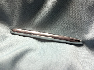 I am sure other reviewers have mentioned this, but really the only disappointing thing about this pen is the ink. Yes, it's a Space Pen, so it writes upside down, underwater, through grease, etc. But the ink comes across as just ordinary ballpoint pen ink. And that's not a bad thing -- it's just ordinary. Still, it is a smooth writer, and it feels good in the hand, so if the ink is just ordinary, then that certainly is not a crime, and it does nothing to detract from the beauty of this pen.
Another, slightly inconvenient, feature of this pen is the fact that it's perfectly round and therefore prone to rolling off a table or desk. They do sell clips for the pen on the Space Pen website, which would help the rolling issue.
Speaking of the website, it's well worth a visit. The company has taken a simple pen design and cleverly embellished it in every possible (and collectible) way. There's a Breast Cancer Awareness version (in pink, naturally), Space Pens with military insignias, religious symbols, Halloween pens, and pens in every possible color and finish. I don't need more than one Space Pen (especially since I can't really see this as a Daily Writer), but the website certainly does make one salivate.
So my verdict? I'm glad I bought one, just to satisfy my curiosity and to be able to say that I own one of these famous and historic pens. But I will take a G-2 or a PaperMate any old day.
The pen is definitely a thing of minimalist beauty. All shiny chrome and sleek like a beautiful bullet. In the package it looks impossibly small, which initially worried me since I have large hands, and trying to write with a too-small pen is the worst kind of torture.


Did I say minimalist? It fits in a pocket so well that you don't even know it's there. In fact, as I carried it around in my pocket today, I found myself repeatedly putting my hand in my pocket and it was just so I could absentmindedly caress the smooth finish of the pen. (Is that weird? I don't think so.)

Another, slightly inconvenient, feature of this pen is the fact that it's perfectly round and therefore prone to rolling off a table or desk. They do sell clips for the pen on the Space Pen website, which would help the rolling issue.
Speaking of the website, it's well worth a visit. The company has taken a simple pen design and cleverly embellished it in every possible (and collectible) way. There's a Breast Cancer Awareness version (in pink, naturally), Space Pens with military insignias, religious symbols, Halloween pens, and pens in every possible color and finish. I don't need more than one Space Pen (especially since I can't really see this as a Daily Writer), but the website certainly does make one salivate.
So my verdict? I'm glad I bought one, just to satisfy my curiosity and to be able to say that I own one of these famous and historic pens. But I will take a G-2 or a PaperMate any old day.
Tuesday, October 16, 2012
Shout-Out to the Lunatik Touch Pen
I'm a bad blogger, I know. The number of posts I have written on this blog would not fill the smallest dimple on the smallest thimble. Maybe it's something in the water or the air -- all of the pen/pencil/paper blogs I follow have been pretty much MIA for weeks now. So I decided I would rectify the situation by posting a blog entry myself.
Today I feel compelled to give a shout-out to a pen that I have been using for several weeks now: the Lunatik Touch Pen -- Alloy Model. I originally ordered one of these when they were being offered as part of a Kickstarter campaign. But then the production and shipping on the pens was delayed, so the company sent me a free pen (the regular all-plastic body version) for my "inconvenience," which I assure you was only in their heads, not mine! (Lesson #1 on how to be a Great Company: surprise your customers with little -- or big -- presents even once, and you will have a happy customer for life. Just sayin'.)


So now I have two of these pens. And even though I just carry one at a time, I love both of them. I did NOT love the ink cartridge they came with, however. The ink was fine initially -- jet black and free-flowing, just exactly how I like it. However, it wasn't long before the pen began sending out nasty blotches of ink that began getting all over my hands and papers and my students' hands and papers. Don't get me wrong -- I like ink blotches as much as any other pen aficionado, especially when they come from a PaperMate Write Bros. pen, for some reason. But this really was nasty, and it simply wouldn't do.
So I investigated the internal situation of this pen and found a cartridge that looked suspiciously like a Pilot G-2 ink cartridge. Not labeled as such, of course, and more than likely made by a different manufacturer. But the spitting image otherwise. So I cannibalized a black G-2 I had sitting around the house (and since this is one of my favorite pens of all time, I had LOTS), and the G-2 cartridge fit perfectly. And WORKED perfectly, with no more annoying blots. (In other words, it wrote like a G-2!) Now it is a perfect pen in every way.
But wait, there's more! (Echoes of every bad infomercial you've ever seen on TV.) This pen is also a stylus, of course, when the pen is retracted. And it's a darn good stylus too. I speak as one with experience, having bought at least 5 or 6 different styluses when I first got my iPad. I don't use a stylus a lot (so you were right, Mr. Jobs) but there are times when I just want one. And when I need one, I need it to work perfectly and fool the iPad screen into thinking it's my warm, greasy finger touching it. That doesn't sound very complementary, I know, but the stylus part of the Touch Pen is a VERY GOOD stylus, just as good as your finger. And that's saying a lot, if you have also been on the hunt for the perfect stylus like I have.

The pen is thick, which you can sort of tell from the pictures, and initially I thought I wouldn't like a pen that thick, since I do normally gravitate towards thinner pens. But the Touch Pen turns out to be a perfect thickness for writing of every kind, and more than one of my students (who get to use my pen when they sign their registration forms or other important documents) have commented that it "feels really good" in their hands, and "that's a nice pen." (These comments are from students who I'm pretty sure don't have the same pen/pencil/paper sickness I do.)
So in conclusion? I am very happy with this pen. I would promptly buy another one if I ever lost the two I have. I carry it every day, and I use it every day.
And just because there are people out there who care about things like this, I was not compensated in any way, shape, or form for this review. I did it because I really, really, really love this pen!
Today I feel compelled to give a shout-out to a pen that I have been using for several weeks now: the Lunatik Touch Pen -- Alloy Model. I originally ordered one of these when they were being offered as part of a Kickstarter campaign. But then the production and shipping on the pens was delayed, so the company sent me a free pen (the regular all-plastic body version) for my "inconvenience," which I assure you was only in their heads, not mine! (Lesson #1 on how to be a Great Company: surprise your customers with little -- or big -- presents even once, and you will have a happy customer for life. Just sayin'.)

(Image from the Lunatik website where you can buy this awesome pen!)

(Image from the Jetpens.com website where you can also buy this fantastic pen!)

My crappy picture of my Touch Pen resting comfortably on my MacBook. But look at the silver alloy of the pen -- it's essentially the same finish as the MacBook, which means it's WONDERFUL.
So now I have two of these pens. And even though I just carry one at a time, I love both of them. I did NOT love the ink cartridge they came with, however. The ink was fine initially -- jet black and free-flowing, just exactly how I like it. However, it wasn't long before the pen began sending out nasty blotches of ink that began getting all over my hands and papers and my students' hands and papers. Don't get me wrong -- I like ink blotches as much as any other pen aficionado, especially when they come from a PaperMate Write Bros. pen, for some reason. But this really was nasty, and it simply wouldn't do.
So I investigated the internal situation of this pen and found a cartridge that looked suspiciously like a Pilot G-2 ink cartridge. Not labeled as such, of course, and more than likely made by a different manufacturer. But the spitting image otherwise. So I cannibalized a black G-2 I had sitting around the house (and since this is one of my favorite pens of all time, I had LOTS), and the G-2 cartridge fit perfectly. And WORKED perfectly, with no more annoying blots. (In other words, it wrote like a G-2!) Now it is a perfect pen in every way.
But wait, there's more! (Echoes of every bad infomercial you've ever seen on TV.) This pen is also a stylus, of course, when the pen is retracted. And it's a darn good stylus too. I speak as one with experience, having bought at least 5 or 6 different styluses when I first got my iPad. I don't use a stylus a lot (so you were right, Mr. Jobs) but there are times when I just want one. And when I need one, I need it to work perfectly and fool the iPad screen into thinking it's my warm, greasy finger touching it. That doesn't sound very complementary, I know, but the stylus part of the Touch Pen is a VERY GOOD stylus, just as good as your finger. And that's saying a lot, if you have also been on the hunt for the perfect stylus like I have.

(I know the effect of a stylus is just as much a function of the app you are using as the nature of the stylus itself. HOWEVER, this stylus really does seem to give me more control over what I am doing on the screen than do other styluses. That's what I was trying to convey with my lines and squiggles.)
So in conclusion? I am very happy with this pen. I would promptly buy another one if I ever lost the two I have. I carry it every day, and I use it every day.
And just because there are people out there who care about things like this, I was not compensated in any way, shape, or form for this review. I did it because I really, really, really love this pen!
Monday, April 9, 2012
NaPoWriMo Day 9
"Thoughts"
Am I me
Or someone other?
Do I feel
Like just another?
What’s inside
My little brain?
Can I be
Myself again?
Every me
Is somehow different
As time grows even
More inconsiderate.
Sometimes I wish
For younger me’s
Or smarter me’s
That ignore the trees
In favor of forest.
But hindsight’s king
Over past lives
And future things.
Sunday, April 8, 2012
NaPoWriMo Day 8
"Taxes"
What would it hurt
If we actually told them
How we wanted our money spent?
I don't mind the paying --
Deep down, that is --
I mind the spending
On wars I don't understand
And corporations I don't like
And fat cats that get continually fatter
At my expense.
So I would like to fill out
One more form
And tell them to spend my money on beauty,
Not decay;
And learning,
Not ignorance;
And narrowing our many differences,
Instead of creating vast seas of division.
Saturday, April 7, 2012
NaPoWriMo Day 7
"Where’s my rhyming dictionary?"
Couplets are lots of fun to write,
But they sometimes keep me up all night.
It’s easy to write them totally crappy --
Where the rhyme goes all slippy-slappy.
Much harder to write them right, you know;
Meter, imagery, rhyme, and so
Many more things go into them.
(Here I start to cough up phlegm.)
Maybe I need some old-fashioned consumption;
The poets of old used it and gumption
To pen their rhymes with expert skill.
When I write, it’s like a dull drill
In the hands of a dentist
Who never apprenticed.
Friday, April 6, 2012
NaPoWriMo Day 6
"Sentinel"
Silent dog
Eyes half closed
Motionless
Standing guard in her spot
As close to her owner as possible
Without actually being inside his skin
Silent dog
Eyes half closed
Motionless
Standing guard in her spot
As close to her owner as possible
Without actually being inside his skin
Thursday, April 5, 2012
NaPoWriMo Day 5
"Financial Advice"
Spend your hate wisely
As wisely as you spend your love
Don't spend it on theories
Or philosophies
Or dreams
Or political parties
Or nameless faceless others
Spend love and hate on the things that can grow
Or die
Because of you
And only you
Spend your hate wisely
As wisely as you spend your love
Don't spend it on theories
Or philosophies
Or dreams
Or political parties
Or nameless faceless others
Spend love and hate on the things that can grow
Or die
Because of you
And only you
Wednesday, April 4, 2012
NaPoWriMo Day 4
"Lambs"
Where have these come from?
Where are they going?
Do they know what they are getting into?
Are they aware of what awaits them
At the end?
Would it change their feelings now,
Dampen their happiness,
Circumvent their smiles?
Or would it change nothing,
Their fate decided in a larger,
More cosmic design
Of which they secretly approve?
Tuesday, April 3, 2012
NaPoWriMo Day 3
Dark and lonely water
We are drawn to it
Seeing the nothingness in its depths
Stillness and decay mixed together
Bottomless pit of peace
Calm
Silent
Dead
The teeming microbes say otherwise
Monday, April 2, 2012
NaPoWriMo Day 2
"Rain"
The heavens have opened up
Once again
And the floods are covering the earth
Once again
But I am no second Noah
And all I can do is curse
The skies.
The heavens have opened up
Once again
And the floods are covering the earth
Once again
But I am no second Noah
And all I can do is curse
The skies.
Sunday, April 1, 2012
NaPoWriMo Day 1
"Beginnings"
Often the beginning is messy
Like a piece of paper full of marks
That haven't found the sonnet yet.
Often the beginning is boring
Like countless scales and arpeggios
Before you can play the sumptuous sonata.
Sometimes you want the beginning to be over quickly.
Like a leap into deep, cold water,
The worst part is often
The beginning.
Tuesday, March 27, 2012
NaPoWriMo 2012

You are skeptical.
I can see it on your face.
You are thinking about the 31 Days of My Favorite Writing Instruments plan, back in January, where I blogged about my favorite pens and pencils.
TWO of them, NOT 31.
Well, I never let the facts and reality get in the way of my enthusiasm. So I am planning on writing a poem a day in April, and posting each poem here. They will be dying works of art, for sure, but it will be the act (and regularity, hopefully) of writing that will be important here.
Wish me luck!
Monday, January 2, 2012
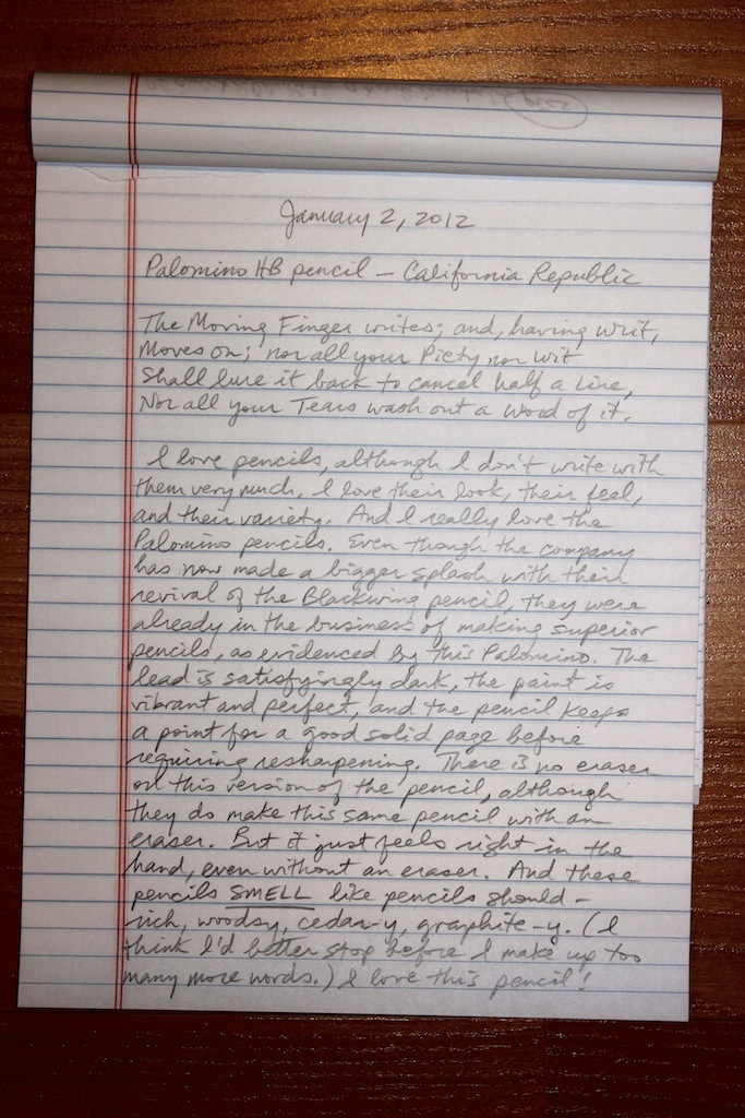
Review: Palomino HB Pencil
Next up, in my 31-day tour through my favorite writing instruments: the Palomino HB pencil from California Republic (the makers of the now more famous Palomino Blackwing pencil).


Subscribe to:
Posts (Atom)